Thursday, February 26, 2015

It’s freezing out there! – So much for global warming?

by Ben Brown-Steiner, Ph.D.


            Yikes it’s cold out there! This winter has brought record cold temperatures to Ithaca [1,2] with continuing waves of Arctic air [3] making life pretty uncomfortable. All the Finger Lakes are frozen except for Cayuga and Seneca [4] but with temperatures expected to barely top freezing for the foreseeable future we may yet see a frozen Cayuga Lake for the first time since 1978-1979 [2].

            The past several weeks are undeniably colder than normal, but what’s normal? Is this simply cold weather or does it imply a cold climate? What can we say about how unusual this winter is, and does it have anything to do with climate change? To answer these questions, let’s conduct some rudimentary data exploration. This is the first step when trying to understand scientific data.

           Expanding the analysis done in a previous post, here are the 10-year average maximum, average, and minimum daily temperatures (˚F) for this December, January, and February (so far). The purple line marks the climatological long-term average:

Ithaca 10-Year Average Temperature (˚F) from [5]

            Looking at the long-term climate we can expect winter temperatures to drop from 30˚F in December to a bottom of around 20˚F in January and then a slight increase to around 25˚F by the end of February. This 10-year running average matches this climatological trend with some noise (a ten year average of weather is not yet climate so we expect this noise).

            Compared to these 10-year averages, how does this year’s December-January-February compare?

Ithaca 2015 Daily Temperature (˚F) from [5]

            Yikes! The average climatological January is 28˚F while this January averaged 17˚F. The average climatological February is 26˚F with this February averaging only 11˚F. This previous December, however, was slightly warm: the average December is 28˚F while this December averaged 32˚F. Taken as a whole, however, this is indeed an unusually cold winter.

            Besides the cold temperatures, are there other aspects of this winter that are unusual? Is there more or less variability? Do other years show similar anomalies, either low or high? Here’s an animated comparison of the past 10 Ithaca winters:

Animation of Daily Temperatures (˚F) for Ithaca from the Past 10 Years from [5]

            Take a look and see if you can find anything unusual. Check out this previous post for good ways of examining these types of data.


            It’s difficult to look at the current weather and draw conclusions about climate, so let’s look at these data from different perspectives to see what we can see. My goal here is to tune your baloney detectors when being presented with weather and climate data and to do some data exploration. Data itself can’t lie, but certain interpretations or presentations of the underlying data can lie, especially if it is being presented out of context. Always be skeptical when you’re presented with data! If portions of data or methods are being hidden, there’s likely a hidden agenda in the presentation.

            For example, here is the average February temperature for the past four years. Based solely on this graph, what can you conclude about Ithaca winters?


Average February Temperature (˚F) for Ithaca from 2012 – 2015 from [5]

            I can hear people shouting in the background: “Look! No such thing as global warming!” And sure, based only on the average temperature of the past four Februaries, completely removed from any larger time or regional context, that might make sense. But what are we missing when we leave out the context? Let’s zoom out to the average temperature of the past ten Februaries:


Average February Temperature (˚F) for Ithaca from 2006 – 2015 from [5]

            Looking at ten years of data we can see that there isn’t much of a trend. The fact that the past four Februaries line up in a nice straight decreasing trend seems to be more of a coincidence than a statement about climate.

            Let’s zoom out a little more. What’s the past ten years worth of December-January-February averages look like?


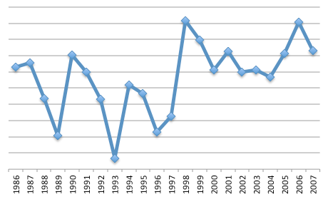
Average December-January-February Temperature (˚F) for Ithaca from 2006 – 2015 from [5]

            The unusual February anomaly in Ithaca is much less apparent here. There appears to be a slight decrease in the winter temperature in the past ten years, but it’s not really a robust trend (or in more technical speak, it doesn’t seem to be statistically significantly different from no trend at all). Let’s zoom out some more. What do the previous 100 winters look like in Ithaca?


 Average Winter Temperature (˚F) for Ithaca from 1900 – 2015 from [6]

(NOTE: The data in in this figure is taken at a different site than the data from the previous figure, thus the Ithaca winter temperatures are not an exact match)
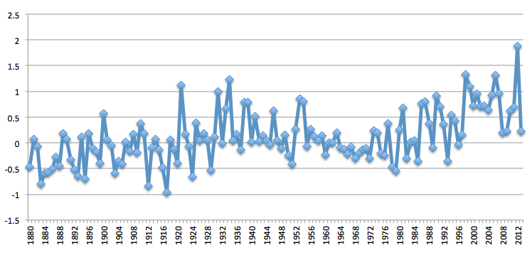
            We definitely get a different perspective here. The year 2012 was the warmest winter of the decade, so it’s not an ideal place to start looking at temperature trends. What we do see is some slow (over multiple decades) increases and decreases, with a maximum in 1932, after which winter temperatures generally decreased until 1978, after which they increased again until around 2000, after which we see no real trend in winter temperatures. These changes, however are small compared to the “noisiness” of the data.

            This 100-year perspective puts the 10-year perspective into a broader climate context. Among some slow variations in temperature from decade-do-decade we see a lot of year-to-year variability. By looking only at 10 years of data we’re missing a lot and we have to be careful about what we conclude from only 10 years of data if we’re talking about climate.

            While we’re looking at the previous 100 years of Ithaca winters, have you ever heard someone older than you talking about how the weather or climate was clearly different when they were young? Did you trust their interpretation and their memory? Let’s take a look. Here’s the average winter temperature for each decade during the past 100 years:

Average Ithaca Winter Temperature (˚F) for Each Decade from 1900 – 2015 from [6]

            If they were born in the 1950’s, 1960’s, or 1970’s, then it was indeed colder when they were young, although only by 3 – 4 ˚F. If they were born in the first half of the century, then these current temperatures are close to what they remember when they were young. Looking at the century as a whole, temperatures have certainly fluctuated but there is no evidence of a clear, unambiguous trend.
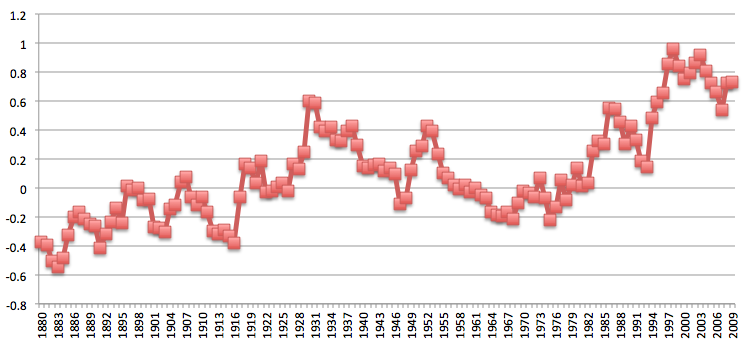
            What if Ithaca is unique? What do the same data look like for the greater Northeastern region? Here’s the December-January-February temperature trend for the entire Northeast for the past 100 years:

Average Winter Temperature Anomaly (˚F) for the Northeastern US Region from 1900 – 2011 from [7]

            Here we see that there is a moderate trend showing increasing temperatures. Over the past 100 years, winters in the Northeast have warmed by around 2˚F, although there’s a lot of variability in this data (i.e. the noise is large compared to the signal). Ithaca’s trends don’t quite match this regional trend, but Ithaca is just a single city in this broad region.

In Conclusion

            This broader climate context deepens our understanding of Ithaca’s unusual winter weather we’re experiencing this year and provides us a long-term perspective. Looking at the data like this is usually the first step in trying to understand a scientific phenomenon since it helps to understand the larger picture. Jumping right into a smaller portion of the data and drawing conclusions (e.g. the previous four Februaries) leads to distortions and misunderstanding, and we all need to be wary of data that is presented without this greater context.

Tuesday, February 24, 2015

The "Pale Blue Dot Image" turned 25

by Don Duggan-Haas

The Pale Blue Dot image just turned 25. Here's a blurb from JPL on the anniversary, and here's a lovely video with Carl Sagan narrating by reading from his book of that title. The image is at the bottom of the post. 


And a quote from the book:
That's here. That's home. That's us. On it everyone you love, everyone you know, everyone you ever heard of, every human being who ever was, lived out their lives. ... There is perhaps no better demonstration of the folly of human conceits than this distant image of our tiny world.
Carl Sagan helped me to understand that humanity is a blip in time on a speck in space. Someone who understands that has a fundamentally different worldview from the worldviews held by most other folks, I'm pretty sure. Whether that difference is good or bad, I can’t say. But it is well grounded in robust scientific findings.

Because everyone I know and love is encapsulated in this blip of time and this speck in space, I treasure it deeply and want to preserve its richness, its diversity, and its life-supporting aspects. We are profoundly lucky to live right here and right now. We have a duty to preserve our luck for future generations, and right now, we are poised to fail at that task. This does not speak to the absence or presence of forces beyond nature, but it does speak to the awesomeness and wonder of nature. Understanding the science of the Earth system has deepened my sense of wonder and my sense of responsibility. This sense of wonder and responsibility begets a responsibility for sharing it. 


As a geoscience educator, I'm lucky to do what I do. 


Original Caption Released with Image:
These six narrow-angle color images were made from the first ever 'portrait' of the solar system taken by Voyager 1, which was more than 4 billion miles from Earth and about 32 degrees above the ecliptic. The spacecraft acquired a total of 60 frames for a mosaic of the solar system which shows six of the planets. Mercury is too close to the sun to be seen. Mars was not detectable by the Voyager cameras due to scattered sunlight in the optics, and Pluto was not included in the mosaic because of its small size and distance from the sun. These blown-up images, left to right and top to bottom are Venus, Earth, Jupiter, and Saturn, Uranus, Neptune. The background features in the images are artifacts resulting from the magnification. The images were taken through three color filters -- violet, blue and green -- and recombined to produce the color images. Jupiter and Saturn were resolved by the camera but Uranus and Neptune appear larger than they really are because of image smear due to spacecraft motion during the long (15 second) exposure times. Earth appears to be in a band of light because it coincidentally lies right in the center of the scattered light rays resulting from taking the image so close to the sun. Earth was a crescent only 0.12 pixels in size. Venus was 0.11 pixel in diameter. The planetary images were taken with the narrow-angle camera (1500 mm focal length).
Image Credit:
NASA/JPL


Friday, January 30, 2015

How can science help us answer the question “what should we do about climate change?”

by Ben Brown-Steiner


“...there are known-knowns; there are things we know we know. We also know there are known-unknowns; that is to say we know there are some things we do not know. But there are also unknown-unknowns—the ones we don't know we don't know.” - Donald Rumsfeld

When we approach a scientific topic, be it climate science, cancer research, crop yields, or nuclear physics, we typically expect two distinct things. First, we expect the scientists in the field to have answers to our questions. What’s the weather going to be tomorrow? How do I stop my tomato plants from dying? Can we use nuclear energy to power our city? Second, we expect individual scientists to expand the general body of scientific knowledge by attempting to understand the unknown. We fund research hoping to shine a light in the many dark corners of the natural world that are not yet understood. Can we create better weather forecasts? Can we improve on current methods of tomato gardening/farming? Can we discover a safer way to use nuclear energy?

These two expectations, to know and to find, are examples of known-knowns and known-unknowns. We expect scientists to have a body of knowledge (known-knowns) as well as be capable of pushing the boundaries to expand this body of knowledge (known-unknowns). We look to science textbooks for answers, and fund research grants with clear expectations of improving our world. The unknown-unknowns are pesky and troublesome. Since we don’t know what they are, it’s difficult to make a plan to discover them. Often, we rely on luck to uncover these unknown-unknowns (I’m going to talk about unknown-unknowns in a future post).

However, science (in general) and scientists (in particular) are often approached with another question that the tools and methods of science are not designed to address: what should we do? What should we do to address climate change? What should we do to reverse the trend in cancer rates? What should we do about nuclear energy, tar sands, wind energy, habitat loss, ocean acidification, and infant mortality?

I want to point out here that I am talking about pure science. Applied science and engineering have real-world, practical components with budget, political, or regulatory limitations and expectations that direct "what should be done." But even a pure scientist, who is solely concerned with scientific discovery, does not always wear a pure science hat. Every scientist is also a citizen, with a personal belief or value system that is almost always partially independent of their scientific training.

This “should” question is the question of our time, and science, on its own, is utterly unable to address it. The following conceptual diagram, which traces back to Plato (I’ve changed Plato’s ‘values’ to beliefs) helps us understand why:


This figure makes a clear distinction between what is true and what we believe. By and large, most people strive to merge the two spheres, but often fail. Beliefs are not always true. For instance, nearly 90% of Americans who drive a car believe that they are better than average drivers [1]. By definition, this cannot be true; the average American is a better driver than 50% of Americans and a worse driver than 50% of Americans.

There may also be truths that we don’t believe. For instance, many of us are afraid of sharks and believe them to be really dangerous. However, more people are killed by horses, cows, bees, and deer than sharks in a given year [2]. This true fact, however, is very unlikely to alter many people's beliefs about the dangerous nature of sharks.

Where does science fit into this? Science, which is concerned exclusively with the observable world, is able to speak only to the truth circle. In addition, science is certain of some things and uncertain about others. We are certain (in the center of the truth circle) that CO2 is made up of an atom of carbon and two atoms of oxygen. We are highly certain (towards the center of the truth circle) that increased concentrations of CO2 in the Earth’s atmosphere increase the global temperature. We are uncertain (towards the boundary of the truth circle) exactly how increased CO2 concentrations will influence the atmosphere/ocean/ice/land/biological system.

And, according to Plato and the above diagram, knowledge, wisdom, and decisions for action exist at the overlap between truth and belief. For instance, the question “how much CO2 should we emit?” depends both on the truth (via science) and our beliefs about how much is acceptable (via a multitude of sources). Or the question “should I eat meat?” depends on the current scientific understanding of the state of meat production in the modern world and each person’s individual belief in what is right [3].

This is an important distinction because people frequently advocate a course of action and cite science, as if that is all that was needed to make a decision. What people often leave out when advocating a course of action is a statement about their particular belief system. There are numerous examples: climate change, renewable energy, hydrofracking, meat production, vaccines, abortion, and so on.

Much of the bitter debate, anger, and confusion related to these issues comes from this basic misunderstanding. When someone says, “we should do [this action] because of [this scientific conclusion]!”, what they are really saying is “we should do [this action] because of [this scientific conclusion] and because I believe in [this value system]!” A scientific conclusion cannot on its own address questions of “should.”

Future attractions:
I’ve written a lot about issues surrounding actual climate science, so for the following posts I will review many of the “known-knowns” of climate science. After that I will address some of the known-unknowns, and then I’ll discuss some of the potential unknown-unknowns.


[1]: http://en.wikipedia.org/wiki/Illusory_superiority#Driving_ability
[3]: Personally, I love meat, but I strive to make sure it is locally sourced and humanely treated. That’s not a scientific evaluation but a belief/value that I hold.

Friday, January 9, 2015

Finding a Signal in the Noise

by Ben Brown-Steiner

(Note: This post follows up on ideas presented in my previous post, and I highly recommend you read that post before this one).

Take a look at the following two graphs.

Screen Shot 2014-11-12 at 5.38.42 PM.png Screen Shot 2014-11-12 at 5.39.00 PM.png

They both cover the same years (1986 - 2007), and I’ve removed the vertical axis labels because that would (for the moment) ruin all the fun.

Before I give hints to what these two plots represent, can you venture any guesses? Is there a signal in either of these plots or is it just noise?

For a first pass I’d say they both are generally increasing, but not consistently. They both wiggle, although the one on the right wiggles more dramatically (higher variability). The left one seems to plateau and then drop off after 2004, while the right shows a large jump around 1998 and seems to plateau after that.

Now for a hint: both of these plots represent something which we suspect has changed or is changing over time, and we have some expectation that we’d be able to detect these changes by studying these graphs. Can you guess where these changes happened (either one year or a range of years)?

A second hint: in one of these graphs, a distinct change happened in 1998. In the other graph the changes have been gradual over time.

Alright. The left graph is the number of home runs hit by Barry Bonds each year throughout his career. It’s generally accepted that Bonds started taking steroids in 1998. The right graph is the average annual temperature anomaly (meaning the mean temperature from 1951 - 1980 has been removed) over the US, and it’s generally believed that the climate has been warming over these years.

And, almost maliciously, the graph of Bond’s home runs doesn’t show a clear jump after 1998 (when he started taking steroids) while the temperature plot does. While we could speculate that the US temperature spikes as a result of Bond’s steroid use, it’s better to look at the 1998 jump in temperatures as a result of the 1997/1998 El NiƱo event (which I’ll write about in a future post) and the plateau afterwards as some form of variability (see my previous post).

What can we say about the influence of steroids on Barry Bond’s home runs? We can confidently look at year-to-year changes and try to explain what we see because we would expect an athlete to improve every year, reach a peak, and then either decline or retire. We expect any changes to his body (i.e. steroids) to be reflected in the amount of home runs he makes in a year. We see that before he started taking steroids, his home run total was in a slight decline. We also see that after he started taking steroids, his home runs spiked. However, after 2001 his home runs dropped again. Perhaps this is because he stopped taking steroids, or maybe he was just getting old (I’m not really a baseball fan so don’t know much about Bond’s career).

[As a side note: steroids actually make an excellent climate change analogy. See this video from AtmosNews.]

What can we say about the temperature records and their fluctuations? Since this time period is over 20 years, and we aren’t really talking about climate until we’re looking at at least 20 years (see my previous post), we can’t really say much. The year-to-year fluctuations are so large that it’s hard to draw any strong conclusions. To get a better idea of the climate, let’s look at the full US temperature record (1880 - 2011):

Screen Shot 2014-11-12 at 5.58.42 PM.png

We can see more clearly now an increasing trend starting in the 1960s, but there’s still a lot of wiggles (or noise). One common method for reducing the noise level (also called smoothing) is to take a moving average. In the following figure, every yearly datapoint is the moving five-year average (we average the two previous years, the current year, and the two future years together) from the same data as the previous graph:

Screen Shot 2014-11-12 at 5.59.57 PM.png

Without the annual noise it’s easier to see a trend, especially after 1960. This particular dataset stops at 2009, and I want to note that the following three years were all warmer than 2009 [1]. This method has allowed us to reduce the “noise” which enables us to detect the “signal” better. We can also see the “warming hiatus” during the last 10 years, but once again, 10 years isn’t long enough to really be climate yet. It’s still weather. I’ll write a post about the warming hiatus in the near future.

There’s so much more we can explore with climate signals and weather noise (and I will address more of these in future posts). But for now, let’s leave it here.

The data for the plots was obtained from these sites:
[1]: http://www.epa.gov/climatechange/images/indicator_downloads/temperature-download1-2014.png