
(Note: This post follows up on ideas presented in my previous post, and I highly recommend you read that post before this one).
Take a look at the following two graphs.

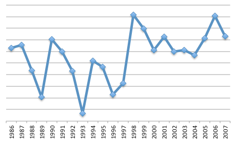
They both cover the same years (1986 - 2007), and I’ve removed the vertical axis labels because that would (for the moment) ruin all the fun.
Before I give hints to what these two plots represent, can you venture any guesses? Is there a signal in either of these plots or is it just noise?
For a first pass I’d say they both are generally increasing, but not consistently. They both wiggle, although the one on the right wiggles more dramatically (higher variability). The left one seems to plateau and then drop off after 2004, while the right shows a large jump around 1998 and seems to plateau after that.
Now for a hint: both of these plots represent something which we suspect has changed or is changing over time, and we have some expectation that we’d be able to detect these changes by studying these graphs. Can you guess where these changes happened (either one year or a range of years)?
A second hint: in one of these graphs, a distinct change happened in 1998. In the other graph the changes have been gradual over time.
Alright. The left graph is the number of home runs hit by Barry Bonds each year throughout his career. It’s generally accepted that Bonds started taking steroids in 1998. The right graph is the average annual temperature anomaly (meaning the mean temperature from 1951 - 1980 has been removed) over the US, and it’s generally believed that the climate has been warming over these years.
And, almost maliciously, the graph of Bond’s home runs doesn’t show a clear jump after 1998 (when he started taking steroids) while the temperature plot does. While we could speculate that the US temperature spikes as a result of Bond’s steroid use, it’s better to look at the 1998 jump in temperatures as a result of the 1997/1998 El Niño event (which I’ll write about in a future post) and the plateau afterwards as some form of variability (see my previous post).
What can we say about the influence of steroids on Barry Bond’s home runs? We can confidently look at year-to-year changes and try to explain what we see because we would expect an athlete to improve every year, reach a peak, and then either decline or retire. We expect any changes to his body (i.e. steroids) to be reflected in the amount of home runs he makes in a year. We see that before he started taking steroids, his home run total was in a slight decline. We also see that after he started taking steroids, his home runs spiked. However, after 2001 his home runs dropped again. Perhaps this is because he stopped taking steroids, or maybe he was just getting old (I’m not really a baseball fan so don’t know much about Bond’s career).
[As a side note: steroids actually make an excellent climate change analogy. See this video from AtmosNews.]
What can we say about the temperature records and their fluctuations? Since this time period is over 20 years, and we aren’t really talking about climate until we’re looking at at least 20 years (see my previous post), we can’t really say much. The year-to-year fluctuations are so large that it’s hard to draw any strong conclusions. To get a better idea of the climate, let’s look at the full US temperature record (1880 - 2011):
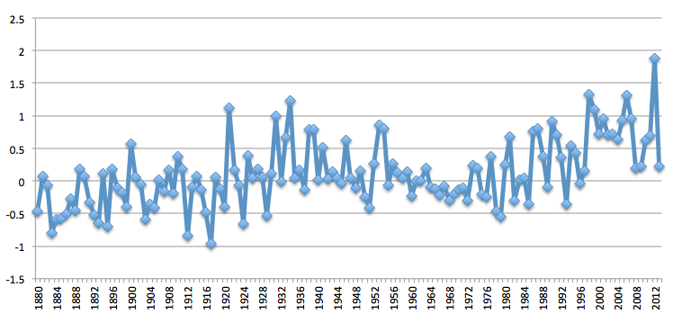
We can see more clearly now an increasing trend starting in the 1960s, but there’s still a lot of wiggles (or noise). One common method for reducing the noise level (also called smoothing) is to take a moving average. In the following figure, every yearly datapoint is the moving five-year average (we average the two previous years, the current year, and the two future years together) from the same data as the previous graph:
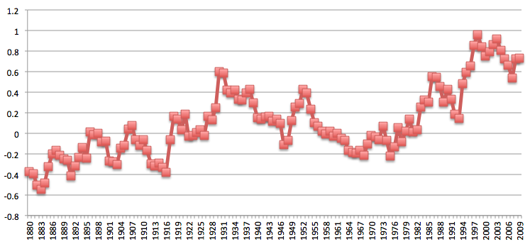
Without the annual noise it’s easier to see a trend, especially after 1960. This particular dataset stops at 2009, and I want to note that the following three years were all warmer than 2009 [1]. This method has allowed us to reduce the “noise” which enables us to detect the “signal” better. We can also see the “warming hiatus” during the last 10 years, but once again, 10 years isn’t long enough to really be climate yet. It’s still weather. I’ll write a post about the warming hiatus in the near future.
There’s so much more we can explore with climate signals and weather noise (and I will address more of these in future posts). But for now, let’s leave it here.
The data for the plots was obtained from these sites:
[1]: http://www.epa.gov/climatechange/images/indicator_downloads/temperature-download1-2014.png
1 comment:
Identifier Nice to you here.
I really enjoyed reading your message. It is an extraordinary and profound conceptual message that you have written here. It's definitely worth reading! many things I learned from this text.
DedicatedHosting4u.com
Post a Comment